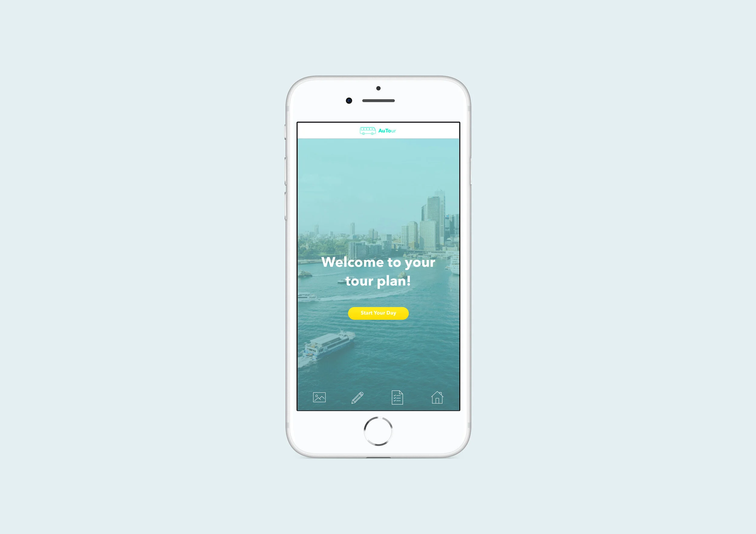
AuTour
A tour planning app for use in an autonomous tour bus to help tourists create a personalised schedule and unique experience while travelling.

Team: Miriam Green | Elaine Chen | Grace Suprapto
Role: UI Designer
Time: 12 weeks
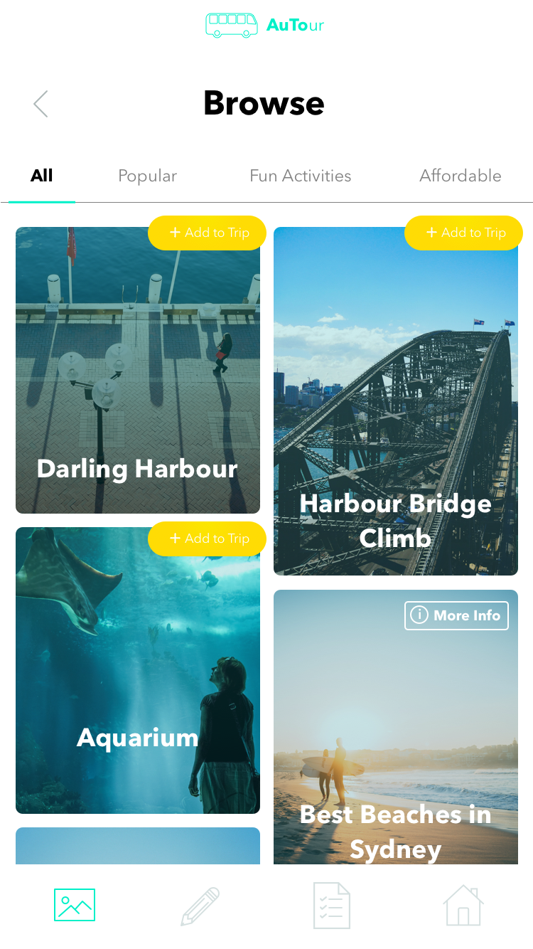
Choose your adventure.
Browse different landmarks and locations nearby, all available at your fingertips.
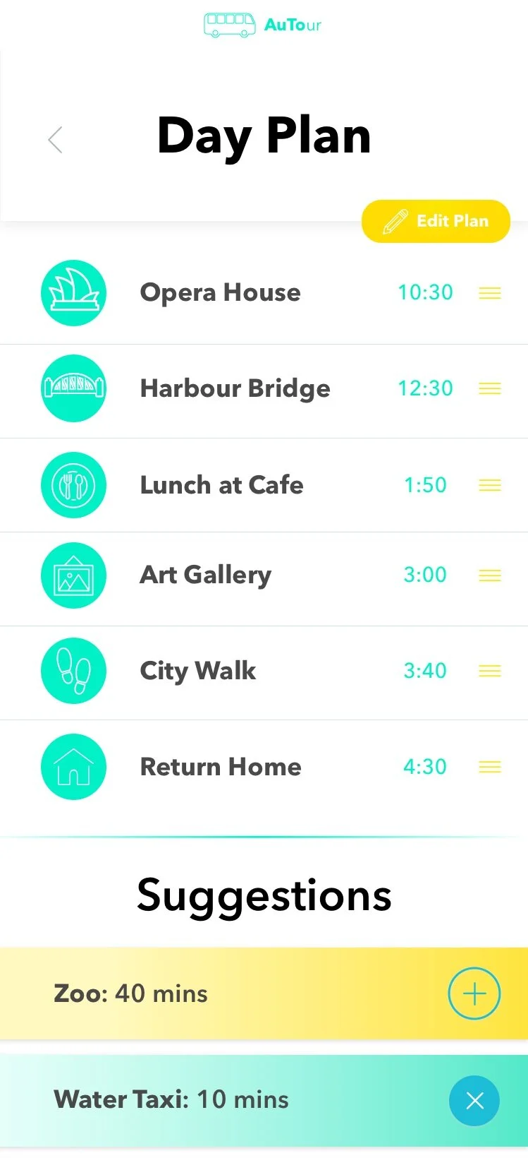
Personalised specifically for you.
Each plan is different and customised to your choices. Your day is tailored completely to you.
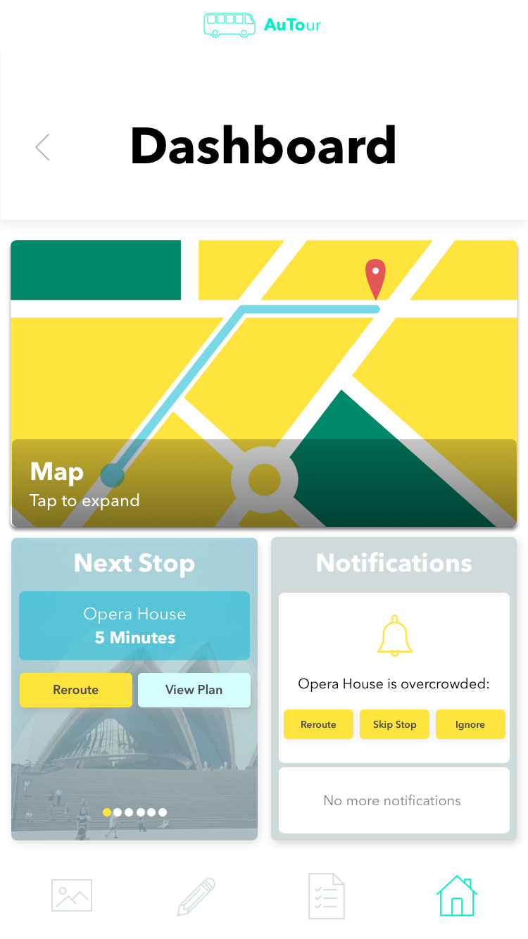
Everything is at your control.
Manage your trip and stay updated from the dashboard. Quickly reroute or edit your plan so your day runs smoothly.
Process
The Brief
‘Map out the interactions that will be required to assist people in interacting with autonomous vehicles in future cities.' More specifically: How do we create a unique and seamless experience for tourists using an autonomous tour bus?
The Solution
Our solution was to take away the rigidity of pre-planned tour scheduling, allowing users to visit only the places they want, in the order they choose. Users can browse and input their preferences for destinations, length of the tour and other activities. The app includes notifications based the autonomous vehicles’ data collection of traffic and crowding, which allows tourists to reroute the journey to avoid these in advance. Complete with additional features including a map, upcoming stops, choice of travel mode and the ability to edit the plan at any point on their journey.
The AuTour tour planning app is a seamless addition to a future autonomous bus which gives users complete control of their experience.
Screens
User Flow
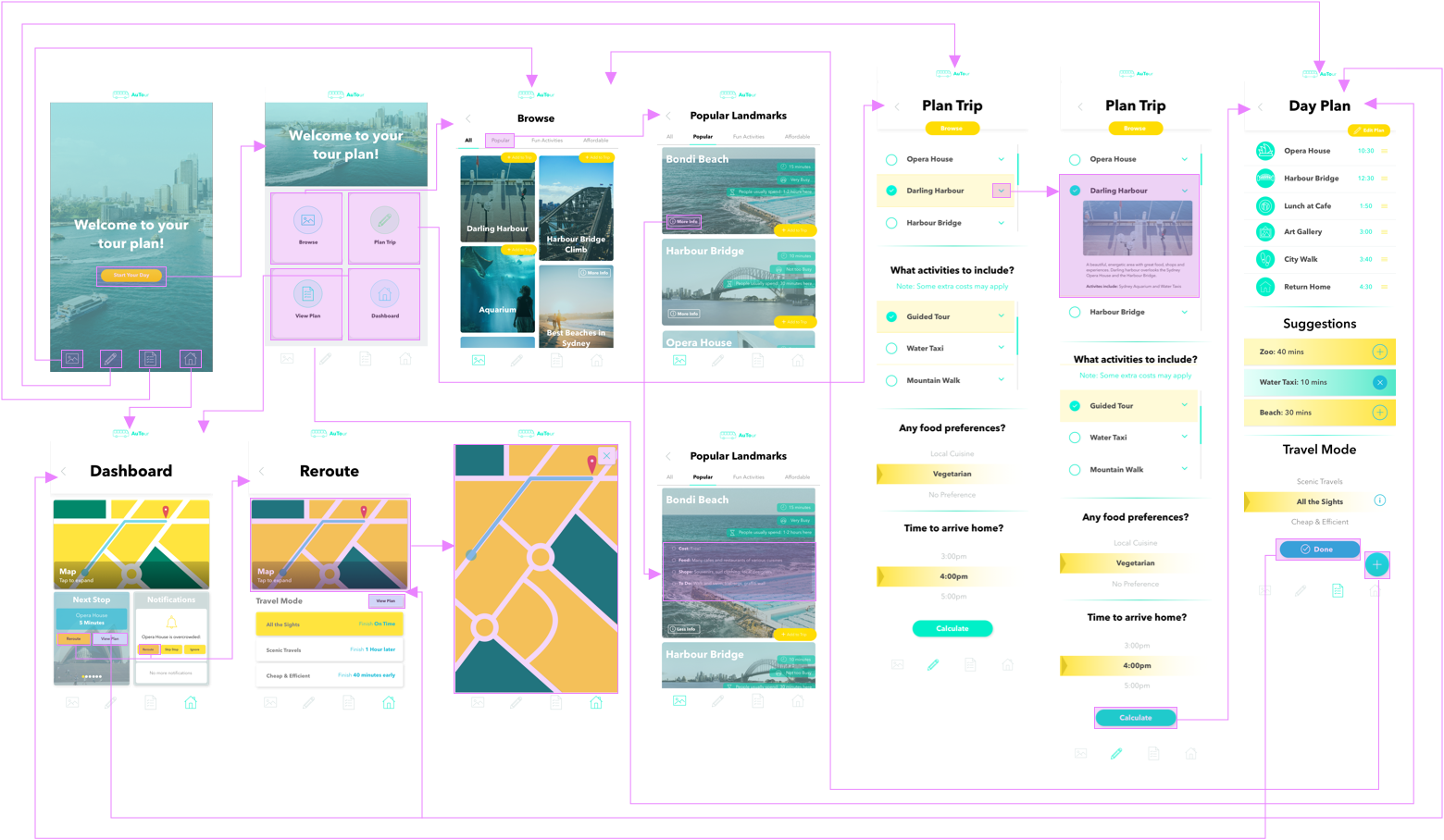
We began the project by brainstorming different context areas and types of autonomous vehicles. Once we had decided on buses and the tourism context, we did primary research, including interviews with our key stakeholders; tourists and travellers, as well as observations of current tour buses in Sydney. We also did secondary research into tourism, tour buses and future autonomous buses.

Observations of Big Bus tour service and user interactions at Bondi Beach
We progressed to initial concepts and sketches. We focused on three key ideas; a planning app, browsing system and a booking/alert concept. We tested these with users using paper prototypes. From our findings, we iterated the planning app, choosing to combine the most successful elements from each idea into one. This iteration included a browsing section, a planning system and an alert for upcoming stops and issues with the route (e.g. Traffic). We tested this with users with the Pop app.
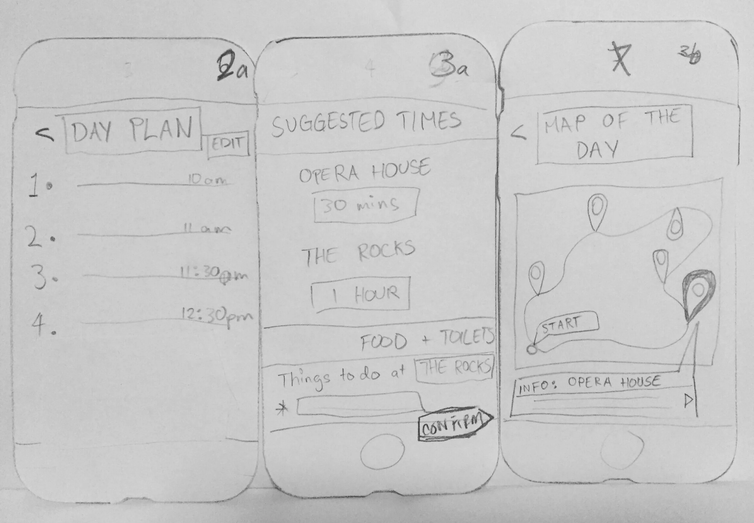
The feedback from this testing was used in the wireframes, in which we focused on element placement and simplifying the interface for users. We tested this, finding that that users desired a main page to return to and easier navigation. This led to the inclusion of the ‘Dashboard’ and footer.
Next, we created the final interface screens using continual testing to iterate and improve the idea from wireframes to final design. We changed the layout, colour and UI elements significantly during this process. We did a last round of testing and created the interactive prototype with Invision. This was well received by users who liked the design and found it easy to use and navigate.
Iterations
The design proven by testing and fit to our user's specifications, having been developed and iterated through multiple rounds of testing. User testing revealed elements that disrupted the flow of navigation. We were able to iterate based on feedback and improve these aspects.
User testing methods used to research the experience include:
Think Aloud
Cognitive Walkthroughs
Interviews
A/B Testing
Surveys & Questionnaires
Day Plan Iterations
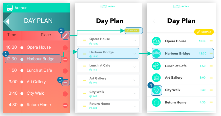
Items were separated so they could be easily rearranged or removed. Icons were added to visually differentiate activities.
Original edit icon wasn't clear so text was added and colour utilised to make the button stand out.


